The Blender Interface
 |
| There's no limit to the interface once you know what you're dealing with. |
Introduction
If you've seen our tutorial "Blender Basics: The Beginners Guide to Using Blender" and feel less intimidated by this software, but are still wondering what everything outside the 3D View is, and exactly what each part is used for, then this is the next tutorial for you to read. This tutorial is going to name each of the different panels you're given when opening blender, what they're used for, and how you can change them or bring in completely new panels, not seen when you start Blender up, to show you just how much you can do with this programme when you know what you're doing.The Default Screen
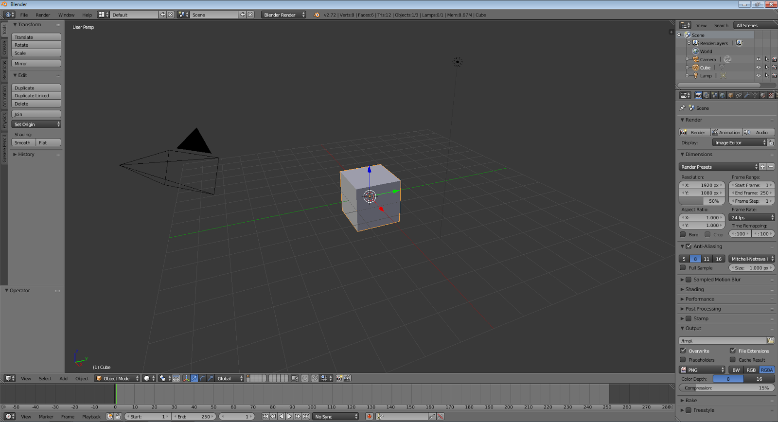
First of all, lets talk about the user interface you're given when you first start up Blender. By default, the interface you are given to work with looks like this:
 |
| default view |
Lets break down this default view into sections and talk about each one separately. The image below is each section broken down and colour coded.
 |
| colour coded default view |
Red - This is the 3D Viewport. Also called the stage. This is the main screen used in Blender to create, edit or remove stuff from your stage. the toolbar on the left is called the tool shelf and has lots of different options to add new stuff in or edit the stuff in your viewport such as smooth the mesh. You can toggle this on or off by pressing the T key. The difference between the 3D view and the stage is that you can view the stage in different types of viewports, and the 3D view is just one viewport.
Green - This is a timeline which is used when animating in Blender. If you don't want to get into animating then you can ignore and even close this tab. If you do see our tutorial on animating.
Blue - This panel is known`as the properties panel. It is used to change the properties of anything on stage. The little tabs at the top are collectively known as the header which is where you choose what type of properties you wish to change. This panel is not to be confused with the Properties Shelf which is hidden but displayed by pressing the N key.
Orange - This panel is known as an Outliner Window and is used to show the different items that you have on your stage.
Yellow - This is known as the info window. This window shows some useful information such as the version e.g. 2.72, which type of render you're in and which set of viewports you're using. These things can be changed using the info window.
Opening New Panels
To open up a new panel look for a little triangle like this:
normally in the top right of an existing panel. click it, hold and drag. Don't do this more times than you need to as you can create an overwhelming amount of screens without knowing how to get rid of them.
 |
| triangle |
normally in the top right of an existing panel. click it, hold and drag. Don't do this more times than you need to as you can create an overwhelming amount of screens without knowing how to get rid of them.
Closing Unwanted Panels
To close an unneeded panel just click the triangle, hold and drag back on the previous panel.
Changing a Panel
To change a panel to what you need it to be, rather than just the 3D View, click this box:
in the bottom left hand corner of the viewport you want to change and select the new panel you want it to be. try them all out to see how they look. I hope this tutorial has helped you.
 |
| viewport editor |
in the bottom left hand corner of the viewport you want to change and select the new panel you want it to be. try them all out to see how they look. I hope this tutorial has helped you.
The Blender Interface
 Reviewed by Opus Web Design
on
07:15
Rating:
 Reviewed by Opus Web Design
on
07:15
Rating:


